2026 Interior Color Trends: Why These Palettes Will Transform Your Home
Palettes are shifting toward earthy, restorative tones like terracotta, plum, and sage. Discover the color trends that will define interior design in 2026.
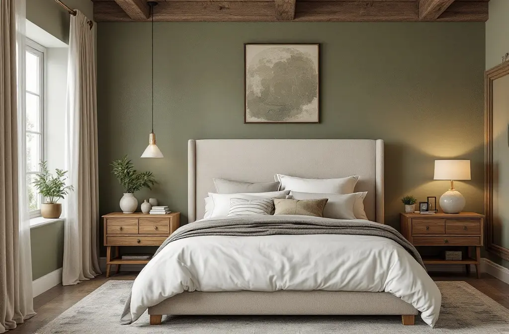
Imagine stepping into a room that doesn't just look good—it feels alive, wrapping you in warmth like a forgotten memory suddenly rediscovered. That's the promise of 2026 interior color trends, where we're ditching the stark minimalism of yesteryears for palettes that whisper stories of earth, emotion, and evolution. But here's the twist: these aren't random hues. They're born from a cultural craving for comfort in chaotic times, blending nostalgia with nature's nudge. As we edge into 2026, paint experts from Sherwin-Williams to Behr are forecasting a shift toward grounded, muddy tones that heal the soul—think milky pastels evolving into restorative darks, all driven by our post-pandemic quest for serenity and sustainability.
Curious how we got here?
Let's unravel the journey and arm you with insider tips to paint your space like a pro.
The Evolution: How 2026 Color Palettes Emerged from 2025's Bold Experiments
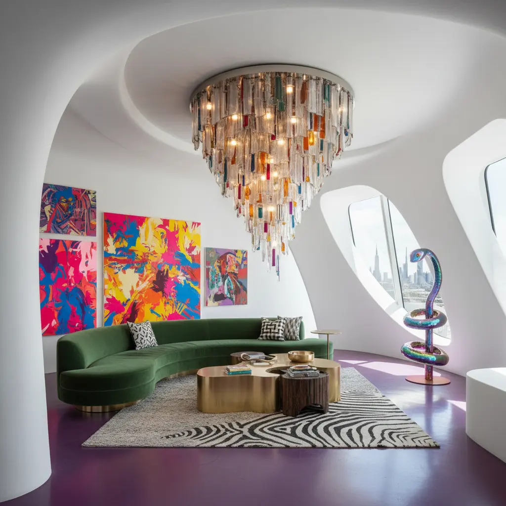
Flash back to 2025: Jewel tones and moody hues dominated, splashing walls with emeralds and burgundies that screamed "maximalist rebellion" against bland neutrals. But why the pivot? Blame it on burnout—designers note we're craving subtlety now, tones that soothe rather than shout, influenced by biophilic design's rise and climate anxiety pushing us toward earthy anchors. Sherwin-Williams' 2026 Colormix Forecast nails it with four palettes: Frosted Tints (soft pastels for calm), Sunbaked Hues (warm terracottas for energy), Restorative Darks (deep plums for introspection), and Foundational Neutrals (creamy beiges for timeless base layers). This progression? It's psychology at play—colors like smoky jade (Behr's Hidden Gem) or warm eucalyptus (Valspar's pick) mimic nature's palette, reducing stress by 20% in studies, evolving from 2025's vibrancy to nuanced depth for longevity in our homes.
What if your living room could double as a stress-relief sanctuary? Enter these palettes—let's break them down by application, style fit, and why they'll rule 2026.
Frosted Tints: Milky Pastels for Serene Spaces
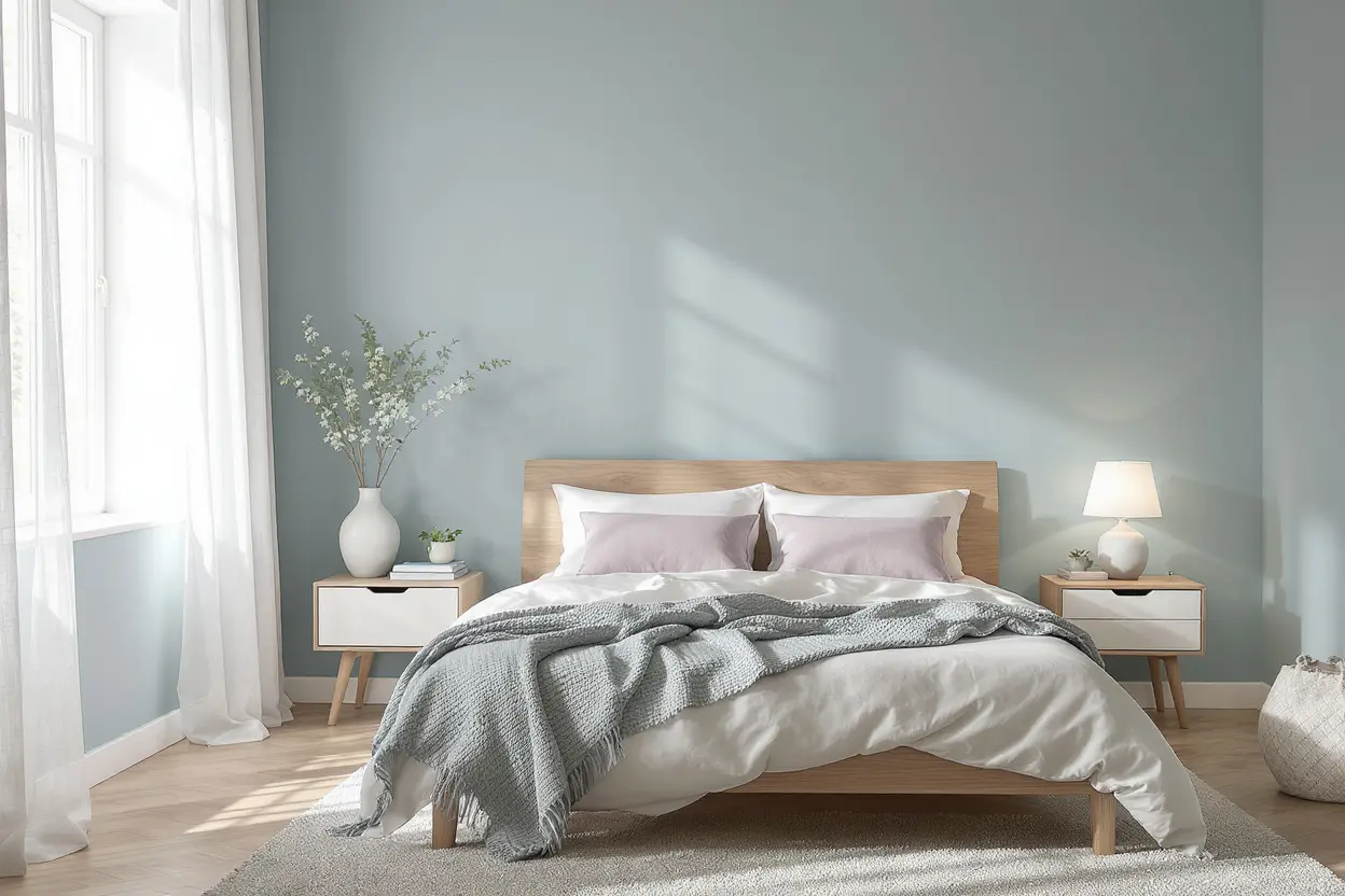
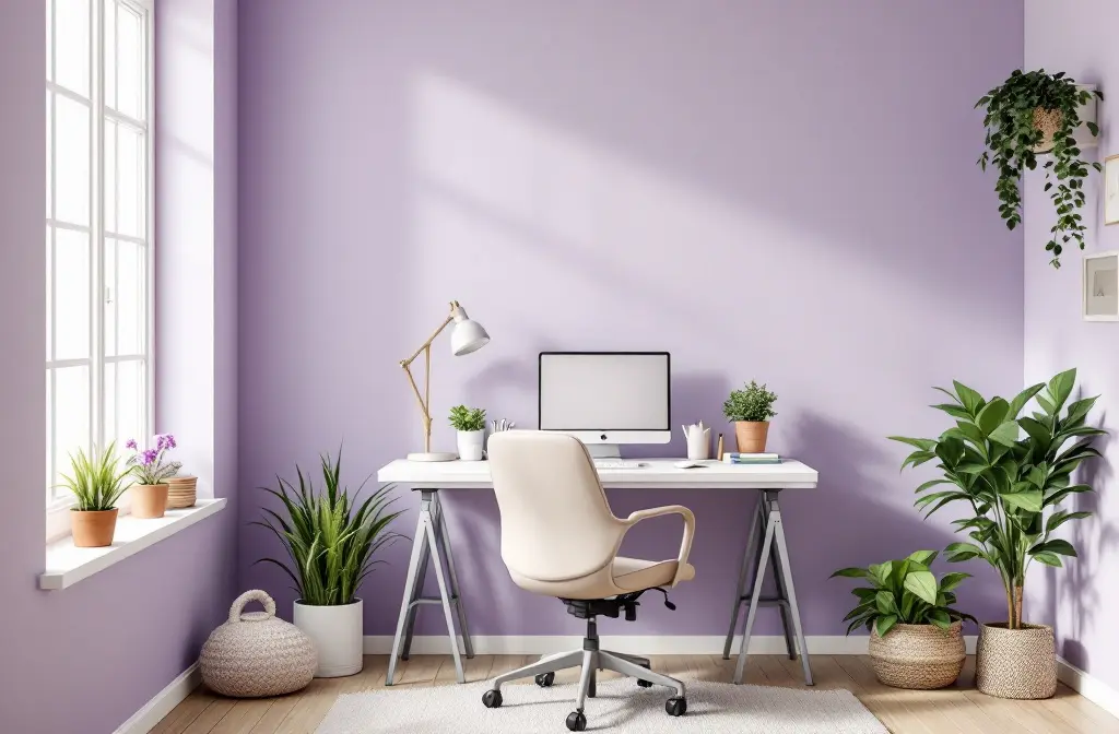
Whispering blues, silvery greens, and muted lavenders—these aren't your grandma's pastels; they're sophisticated escapes. Best applied in bedrooms or home offices where calm reigns supreme, layer them on walls for a cloud-like effect or accents like trim to avoid overwhelming small rooms. Style match? Scandinavian minimalism or coastal chic—they add subtle interest without clashing, evolving from 2025's cool grays as we seek "milky" softness for mental reset in hybrid work eras. Pro tip: Pair with natural wood for that fresh, airy vibe that feels eternally modern.
Sunbaked Hues: Warm Earth Tones for Inviting Vibes
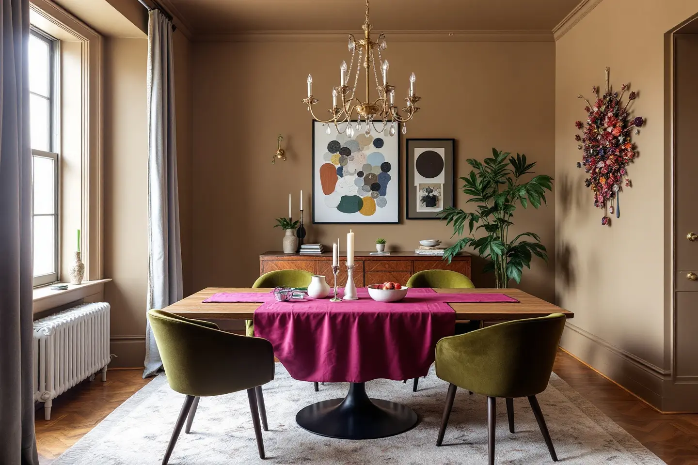
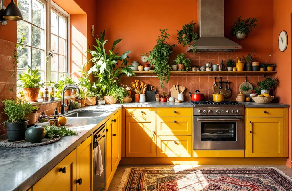
Terracotta, ochre, mustard yellow, and rosy beiges—picture sun-drenched clay pots coming alive on your walls. Ideal for kitchens and living areas craving energy, use them as feature walls or full drenches in open-plan homes to foster connection. They shine in bohemian or Mediterranean styles, grounding spaces with warmth that counters winter blues. Why 2026? Post-2025's jewel overload, these "sunbaked" shades offer approachable coziness, inspired by global warming's call for resilient, nature-mimicking homes—think Behr's Celebration mustard for a pop that boosts mood without fatigue.
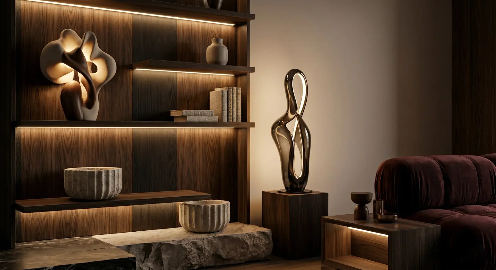
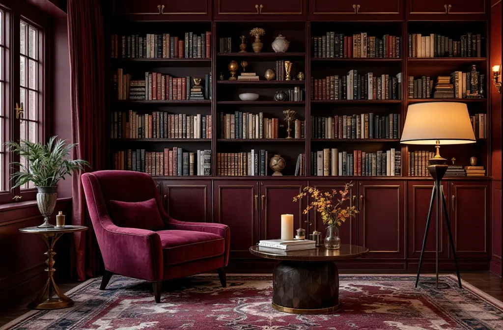
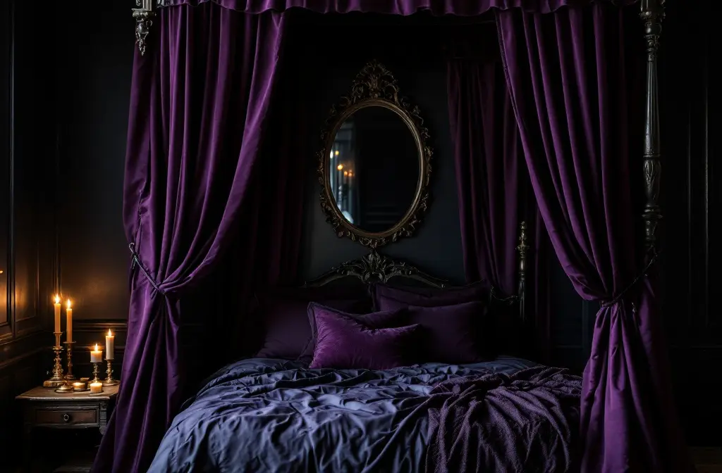
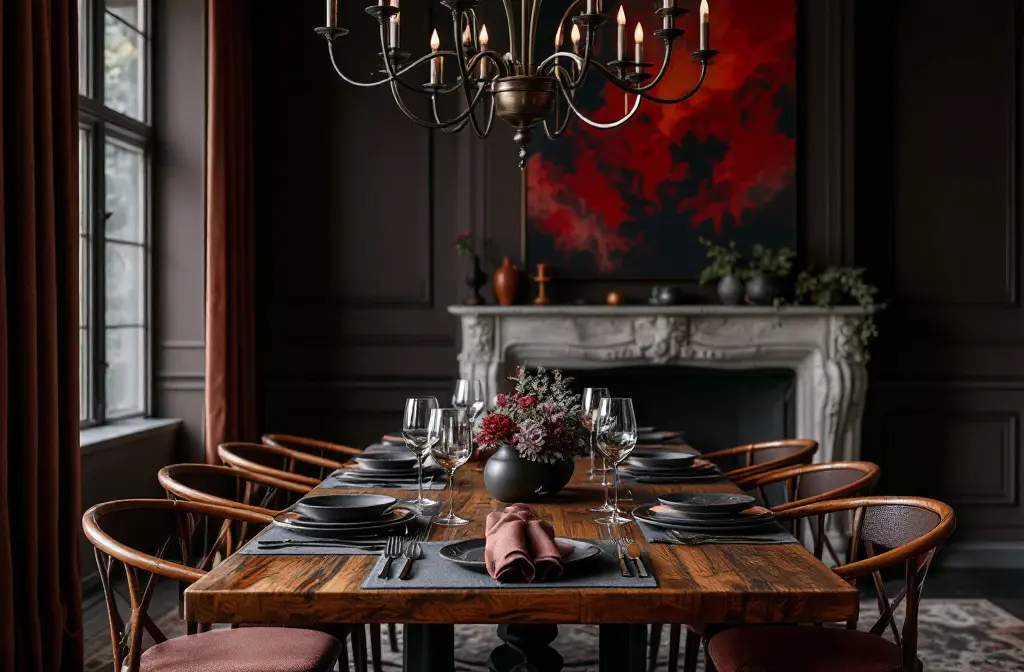
Restorative Darks: Deep Jewels for Dramatic Depth
Burgundy, plum, eggplant, and nocturnal blacks—these moody masters are 2026's secret weapons for intimacy. Reserve for dining rooms or libraries; apply to ceilings for cocooning or accents in larger spaces to prevent gloom. Perfect for Art Deco or Victorian revivals, they add luxury without excess. The why: Evolving from 2025's bold reds, these "muddy" undertones (like Sherwin-Williams' carmine) reflect our need for introspection amid digital overload, creating havens that feel profoundly personal.
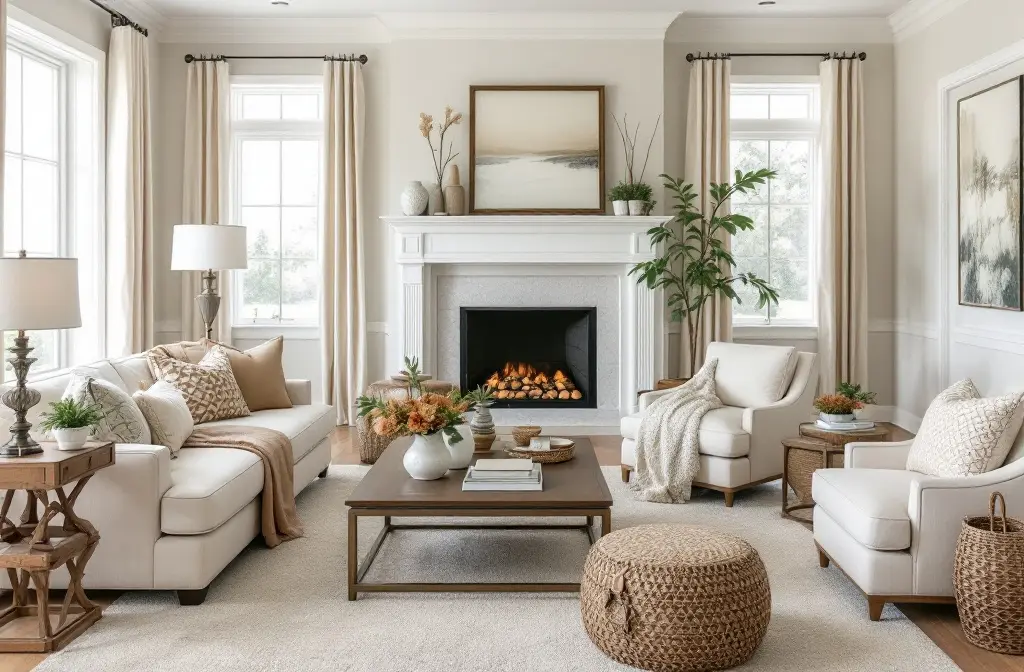
Foundational Neutrals: Creamy Bases for Versatile Foundations
Creamy whites, caramel beiges, and khaki—the unsung heroes building layers. Use everywhere as backdrops: walls in hallways for flow, cabinets in bathrooms for spa-like peace. They suit modern farmhouse or transitional styles, providing a canvas for bolder accents. In 2026, they arrive as antidotes to 2025's saturation, offering pink-undertoned warmth (like Universal Khaki) for homes that age gracefully, driven by sustainability trends favoring timeless over trendy.
By 2026, these palettes aren't just colors—they're lifelines to balance. Start small: a accent wall today could redefine your tomorrow.

Try it on your own project
Free app for iPhone, iPad, Mac, Android and Windows.